Simple T-Shirt Design: Why Less Is More and How to Get It Right
The most wearable, most-complimented custom shirts tend to have one thing in common: simplicity. Here's why, and how to apply it whether you're creating your first design or your fiftieth.
Why simple designs work better on shirts
A t-shirt is a small, moving canvas. Your design needs to read from 10 feet away, look good at an angle, survive being worn with other items, and still look intentional after 50 washes. Complex, busy designs fail on all of these counts.
There's also the print reality: fine details under about 3mm get lost during printing. Subtle color gradients flatten out. Thin lines can bleed together. The physical constraints of printing on fabric push you toward simplicity even if you started with something complex.
The best custom t-shirt designs — the ones people actually wear regularly — tend to be: one clear subject, high contrast, limited color palette, and enough white space that the design breathes on the garment.
Simple design principles that always work
One focal point
Your design should have one thing the eye lands on first — a face, an animal, an object, a bold graphic. Multiple competing focal points create visual noise. Choose your hero and build the design around it.
High contrast
Dark design on light shirt, or light design on dark shirt. The contrast between the design and the garment is what makes it readable. Medium-contrast designs — mid-tone designs on mid-tone shirts — often look muddy in person even when they look fine on screen.
Limited color palette
Two to four colors. More than that and the design starts to look like a poster, not a shirt. A limited palette also makes the design feel intentional and designed rather than assembled. Black and white alone — a strong line art design — is one of the most effective and timeless approaches.
Clear silhouette
If you squint at your design and can still identify the subject from its outline alone, the silhouette is strong. A strong silhouette means the design communicates even in the periphery of someone's vision — which is often how t-shirt designs are "read" in real life.
Breathing room
Don't fill the entire chest panel. Designs that extend to the edges of the print area tend to feel overwhelming. Centered designs with space on all sides feel intentional and designed.
The best simple t-shirt design styles
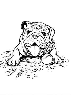
Line art
Black ink lines on a white shirt, or white lines on black. No fill colors — just the drawn outline of your subject. Extremely versatile, reads well at any size, prints beautifully on any garment. Works especially well for portraits, animals, and objects with distinctive shapes.
Flat illustration
Simplified illustration with flat, solid colors and bold outlines. No gradients, no shadows, no texture. The style you see on classic band tees, surf brands, and sports team shirts. Works at any size and reads instantly.
Vintage badge / emblem
A centered circular or shield-shaped composition with the subject inside, bordered by simple typography or design elements. Feels complete and intentional even with minimal elements inside. Classic and always wearable.
Bold pop art
High contrast, flat colors, thick outlines. Bold and graphic — reads from far away. Inspired by Lichtenstein-style comics and Warhol-era graphic art. Works especially well for portraits and faces.
Common mistakes that make simple designs look bad
- Too much text. A few words add context. A paragraph of text turns the shirt into a flyer. If you must use text, limit it to a single line.
- Clip art arrangements. Pasting clip art elements together rarely looks designed — it looks assembled. Start with a real photo or an original illustration instead.
- Over-detailed designs. If your design looks great zoomed in on a screen but loses clarity at 12" wide, the level of detail is too high for printing.
- Wrong design placement. Designs centered too high (near the collar) or too low (near the hem) look off. Center chest, slightly above the nipple line, is the safe placement for most designs.
- Ignoring shirt color. The shirt color is part of the design. A design that looks great on white might disappear on grey or clash with navy. Choose shirt color as part of the design process, not after.
How AI creates simple designs from complex photos
One of the most useful things AI design tools do is simplify. A regular photo is full of visual complexity — lighting variations, background detail, subtle color transitions — none of which translates well to a shirt.
When you put a photo through MadeFromArt with a line art or flat illustration prompt, the AI strips away that complexity and distills the image to its essential elements: the subject, its distinctive shapes, and a clean graphic interpretation. The result is often simpler and more printable than anything you'd create manually from the same photo.
Style prompts that produce the cleanest, simplest results:
"Bold line art, thick black outlines, white background, no fill colors, no text"
"Flat pop art illustration, 3 colors maximum, bold outlines, solid white background"
"Vintage badge style, circular composition, flat colors, white background, no text"
"Simple woodcut print, black and white only, strong contrast, no gray tones"
Create a clean, simple shirt design from your photo
Upload any photo to MadeFromArt and the AI simplifies it into print-ready line art, flat illustration, or badge-style artwork. Simple, wearable, genuinely custom. Two free designs to start.
Start Designing Free